Against my own internal monologue advice, I ran a Core Web Vitals test on my blog. It came back ehhh, okay.
My LCP was the problem, and like most sites, the heaviest thing on nearly every page was an image.
The fix is well-known: serve WebP or AVIF instead of JPEG. They’re smaller at the same quality, and browser support is finally there. So I figured I’d just convert and watch the scores go green.
Turns out “just convert it” is a trap. Wild.
Image formats are a mess. Every format (JPEG, WebP, AVIF) has its own “quality” slider from 1 to 100, and none of those numbers agree with each other. Quality 60 in JPEG, quality 60 in WebP, and quality 60 in AVIF are three completely different-looking images.
They don’t agree on what a number looks like, or how big the file ends up, and the setting barely tracks how good the image actually is. You can’t just pick a number because that’s too logical.
And it gets worse! The right number also depends on what’s in the image. A photo, a flat illustration, and a line-art scan all behave differently at the exact same setting for each file format. Everything sucks.
So instead of shaving a few hundred kilobytes off my pages in an afternoon, I spent weeks working with my AI slop buddy and built a calibration pipeline (as you do). It looks at an image, figures out what kind of thing it is, looks up the quality that actually matches for that kind of thing, encodes it to WebP and AVIF, and keeps whichever comes out smaller (never bigger than the original). Point it at a folder, walk away.
To get those “quality that actually matches” numbers, I had to measure them.
Take a pile of reference images, encode each one to JPEG at every quality from 1 to 100, do the same for WebP and AVIF, and score everything with SSIMULACRA2, a perceptual metric that’s pretty good at guessing what looks the same to a human.
Then, because I clearly have a problem, I did it nine more times with nine other metrics (Butteraugli, DSSIM, LPIPS, and friends).
For each JPEG quality, every metric votes on the lowest WebP/AVIF quality that still matches, and the converter goes with the most conservative vote. So no single metric having a weird day can quietly wreck an image.
It took about 20 hours to get the curves (AVIF at max compression effort is SLOW), but you only do it once and then you’ve got the table forever. My poor Macbook didn’t enjoy it.
I assumed illustrations and line-art would be the fragile ones. Hard edges, flat colors, the stuff that looks like it’d fall apart under compression. So I figured they’d need the highest quality to survive.
Nope. Exact opposite.
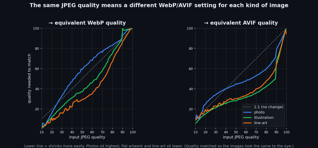
Photos need the highest settings, by a lot. At JPEG quality 80, a photo needs AVIF 60 to match. An illustration only needs 42, and line-art 48. Same input, wildly different answers.
It makes sense once you see it, I guess. A photo is texture everywhere (skin, leaves, grain, sensor noise), and that’s the hardest thing for a codec to hold onto, so it needs more quality to keep it. Flat art is easy. It hits the same score with way less.
Which flips the savings the way you’d hope:
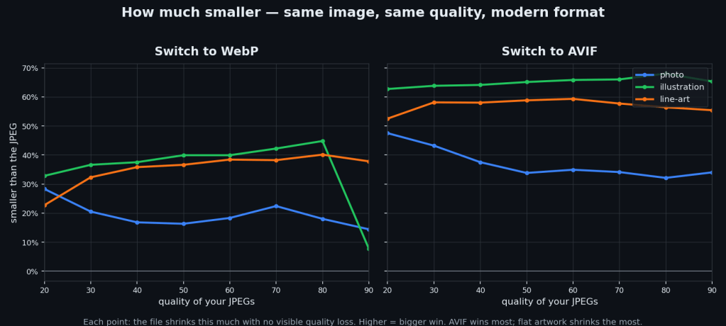
Switching JPEG -> AVIF saves roughly 30–50% on photos, 55–60% on line-art, and 60–65% on illustrations. The flatter the image, the bigger the win. WebP saves less, and on really high-quality flat art it can actually come out BIGGER than the JPEG (which is why the tool encodes both and keeps the smaller one).
Figuring out “what kind of thing is this” was its own little rabbit hole. My first attempt used edge density and saturation to tell photos from illustrations, and it was right about 46% of the time, which is bad.
It turns out the signal that actually works is histogram entropy: a photo’s continuous tone smears pixel values across the whole histogram (high entropy), a flat illustration piles them into a few spikes (low entropy). That one swap took it from 46% to ~91%. Edge density never had a chance. A painterly illustration has just as many soft edges as a photo.
Anyway, it’s all on GitHub if you want it:
Just a couple of Node scripts, no dependencies beyond the encoders. Fast mode just trusts the calibration and converts; --verify re-checks every image against a quality floor if you want a guarantee.
There’s a browser demo too:
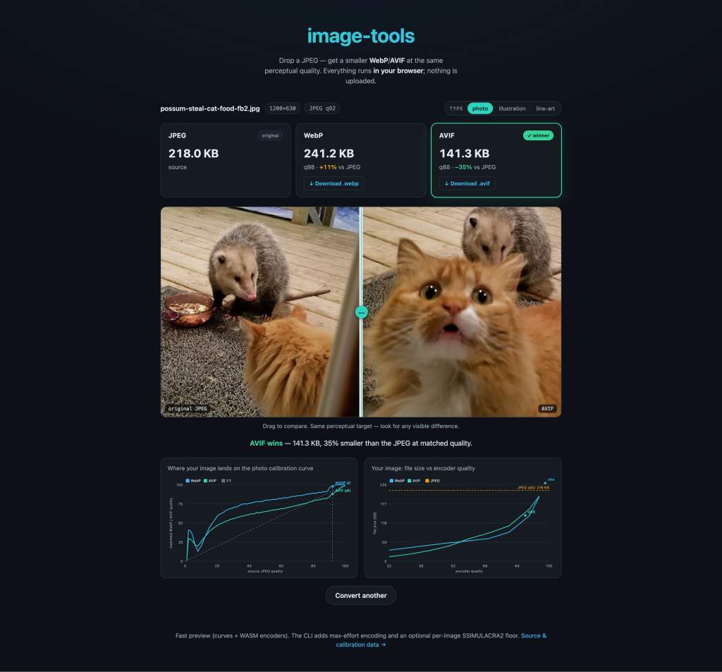
Drop in a JPEG and watch it convert, entirely client-side, nothing uploaded. The calibration data’s open (GPL-3.0), so fork it, run it on your own images, just don’t bother me about it.
A few honest caveats, because I’m not going to pretend this is gospel:
- The datasets are small: 24 photos, 25 illustrations, 19 line-art. Enough to see the pattern, not enough to bet your life on the exact numbers. Like I said 20 hours just for that. Sell your soul to AWS or something and throw thousands of images at it.
- The numbers are specific to these encoders (avifenc, cwebp). Different builds will shift them.
- These metrics are good, but they’re still metrics, not humans. A real eyeballs-on-it study would either back this up or blow it up, and I’d genuinely love for someone to run one, but not me. I’m done.
So, did my Core Web Vitals get better? Ehhh, I don’t care anymore.
Leave a Reply